Design Edit
Made exclusively for Kenley + Luke
October 9, 2026
Thank you so much for trusting me with something as meaningful as your wedding invitations. This proposal is the creative bridge between our discovery call and the custom suite that will soon be in your hands. My goal is to make this process feel simple, inspired, and completely tailored to you.
The Expected Path | The Scenic Route | The Unexpected Journey
01/ THE DESIGN EDIT
To keep the design process easy — and genuinely fun — I’ve mapped out three possible routes for us to explore using what I call The Design Edit. Each one offers a slightly different way of bringing your invitation suite to life, while staying true to the overall vision we’ve talked about.
Think of these sketches as a starting point. They’re meant to spark ideas and help us find the direction that feels most you. We’ll finalize all of the details, quantities, and finishes together before anything goes to print.
The Overall Feel
From the moment you described your wedding — the castle, the old-world romance, the sense of stepping into another time entirely — I knew exactly the feeling we were after.
What you'll find in each direction below is a different way of arriving at that feeling. The palette is consistent throughout: deep green, sage, warm ivory, quiet gold. The mood is constant: romantic, moody, and collected rather than coordinated. What shifts between directions is how far we lean into each element — how expressive the crest, how dramatic the vellum, how unexpected the detail that stops her in her tracks.
A few things run through all three directions, because they were simply too right not to include.
An intertwined K and L — or a full heraldic crest — rendered as original artwork, the kind of mark that anchors the entire suite and carries naturally into menus, place cards, even matchboxes. On the back of the invitation, deep green velvet with a gold foil impression of that same mark: a detail that's felt before it's fully understood. A hand-drawn illustration of Neidpath Castle, because your engagement deserves to be part of the story. Deckled edges, pillowy letterpress, vintage typography — the tactile language of another era. And a LOTR-inspired border for the rehearsal invitation that quietly honors the fantasy without announcing it.
These elements don't match. They belong together. That's the difference between a suite that's coordinated and one that feels like it was collected.
Move through each direction slowly. Let one settle before you look at the next.
THE CLASSIC SUITE
This route reflects exactly what we talked about in your discovery call.
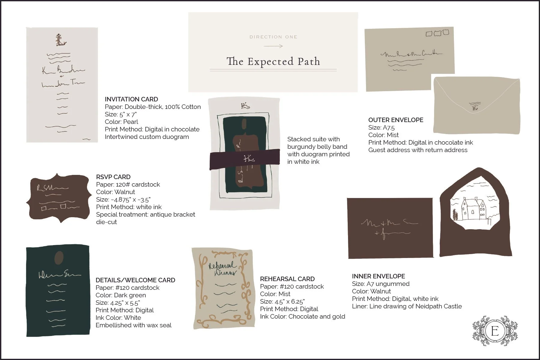
Every suite begins here.
The Classic Suite is rendered entirely in digital print — and that's worth noting, because as you move through these three directions, the print methods build. This one is the foundation, and it's a beautiful place to start.
The invitation centers on a custom intertwined duogram drawn in an old-world romantic style, printed on double-thick 100% cotton paper. It has a crispness to it, but also real weight in the hand. The response card is die-cut in an antique bracket shape — a small detail that softens the edges and adds quiet interest. Your details card is in a rich deep green, finished with a custom wax seal bearing your duogram. If you'd like to carry the wax seal forward from your save-the-dates, that's a lovely option. Both the response and details cards are printed in white ink. The rehearsal dinner card is on a warm neutral stock with text in chocolate and a border in gold — warm and grounded in the palette.
A rich burgundy wrap in a text-weight paper holds the suite together, your custom monogram printed in white at the center. It's the first thing your guests touch.
The double-envelope system uses a warm neutral outer envelope addressed in chocolate ink, and a walnut inner envelope with guest names in white. The liner features a custom line drawing of Neidpath Castle — a quiet nod to where it all began.
THE CURATED SUITE
Here, we had tactile letterpress, handmade paper and velvet for a rich, layered look. This combination is the epitome of beautiful, old-world romantic feeling.
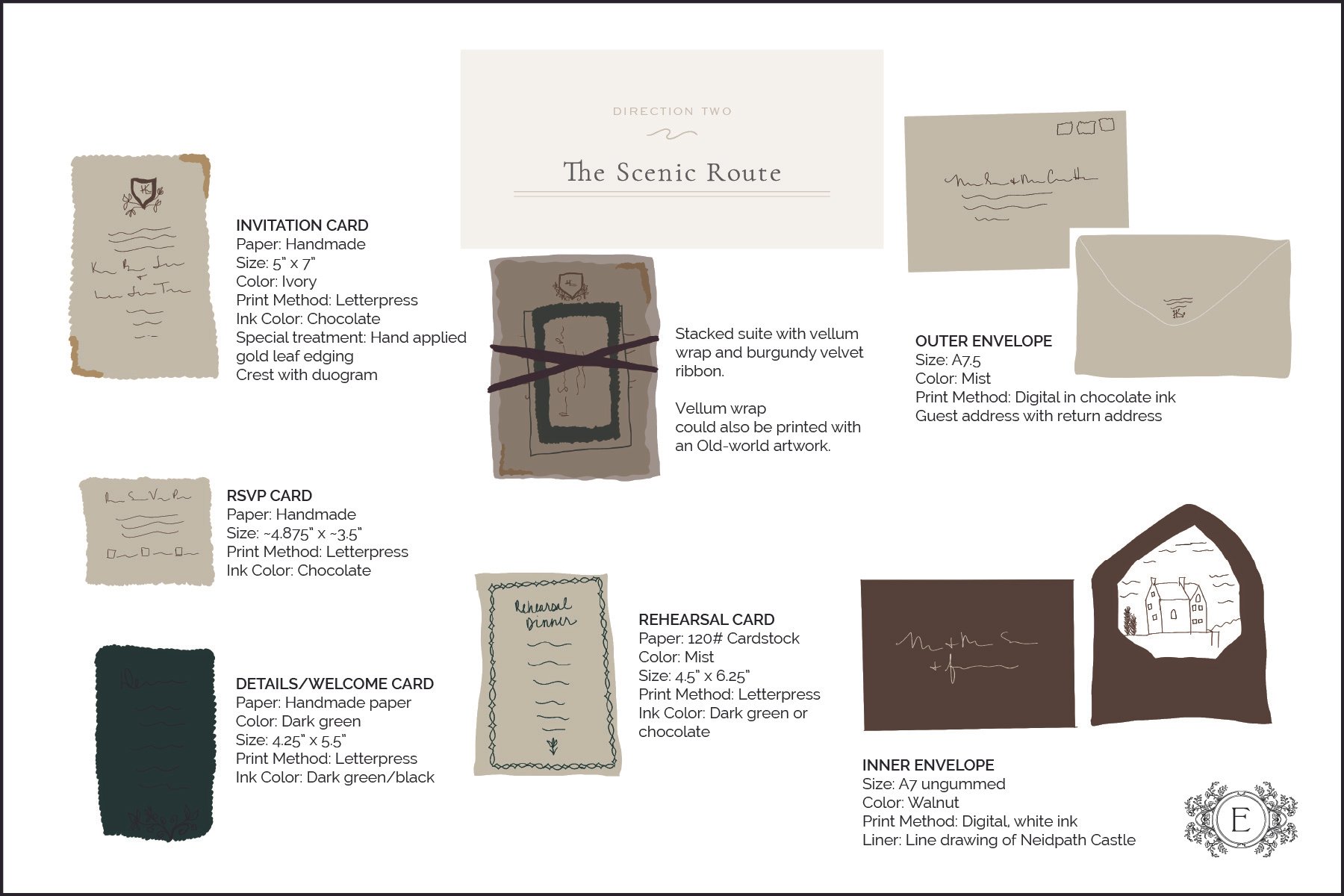
This is where the suite really comes alive.
The Curated Suite layers letterpress, handmade paper, and velvet for a look that feels genuinely rich — old-world romantic without trying too hard to get there.
The invitation is letterpress printed on handmade paper, with deckled edges finished by hand in gold leaf. Not a printed effect — actual gold, applied by hand. At the center sits a custom heraldic crest designed specifically for you, which gives the suite that Regency, Bridgerton, Outlander quality you've been drawn to from the start.
The details card goes deeper into the palette — dark green stock with text in an ink so dark it reads almost black. The rehearsal dinner card features a hand-drawn border with a sculptural, Tolkien-inspired quality that feels at home in this world.
A vellum wrap gathers the suite together — left plain it's clean and ethereal, or we can print it with a moody Renaissance-inspired artwork for a more atmospheric effect. A criss-crossed burgundy velvet ribbon finishes it.
The envelopes and Neidpath Castle liner carry forward from The Expected Path.
THE HEIRLOOM SUITE
Regency period, blind letterpress, velvet and gold foil make their presence known in this truly elegant, classy, moody suite.

This is the one that stops you.
The Heirloom Suite brings everything together — blind letterpress, gold foil, velvet, and a palette so considered it feels like it was pulled from a Regency drawing room. Understated and luxurious at once. Pride and Prejudice meets fantasy, without a single unnecessary element.
The invitation features a reverse frame in an organic floral and leafy pattern, blind letterpressed — meaning no ink, just the impression itself, subtle and tactile and quietly stunning. The text has a handwritten quality that feels genuinely period, as though it arrived from another time entirely. Then you turn it over. The back of the invitation is dark green velvet paper, your heraldic crest or intertwined duogram pressed in gold foil. It's an unexpected moment, and it earns it.
The response card is sage green with dark green letterpress ink — tonal, refined, nothing competing. The details card is die-cut in the same shape as the invitation, letterpressed in that same deep almost-black green. The rehearsal dinner card carries forward from The Scenic Route, now letterpressed to match.
Rather than a wrap, the stacked suite is bound with a burgundy silk ribbon and finished with a die-cut gold foil crest — the first thing your guests see before anything is unwrapped. It announces itself without saying a word.
The envelopes close the experience the way they opened it. Guest names and addresses are written by hand in calligraphy, in a dark walnut ink with an almost watercolor quality — soft-edged, warm, and completely individual. No two exactly alike.
02/ THE INVESTMENT
Each path is quoted for 65 suites and includes everything you've seen here — art design and creative direction, custom artwork, unlimited revisions, all production, addressing, assembly, and shipping. Postage is the one thing we'll calculate together once your final guest count and suite weight are confirmed.
These directions are a starting point. Elements can be mixed and matched across all three until the suite is exactly what you imagined.
The Classic Suite
Custom design & art direction: $2750
Paper & print suite: $2587.83
Hand Calligraphy: n/a
TOTAL INVESTMENT: $5337.83
The Curated Suite
Custom design & art direction: $2750
Paper & print suite: $4205.81
Hand Calligraphy: n/a
TOTAL INVESTMENT: $6955.31
The Heirloom Suite
Custom design & art direction: $2750
Print & paper suite: $3722.25
Hand Calligraphy: $506
TOTAL INVESTMENT: $6978.25
03/ CHOOSING YOUR PATH
When you're ready —
There's truly no rush. Take your time, share it with whoever matters most, sleep on it. When something feels right, I'd love to hear from you below.
04/ WHAT HAPPENS NEXT
Choose your direction
1
You're here. Take all the time you need — there's no pressure to decide today. When one of the three directions feels right, let me know using the form above.
We make it official
2
Once you're ready to move forward, I'll send your client agreement and a 30% retainer invoice. Your spot on my calendar is reserved the moment that's in place.
Your design begins
3
I'll reach out to schedule your Design Kickoff — this is where the real work starts. We'll go deeper into every detail before a single element is placed.
Proofs, refinement, and your final yet
4
We'll move through the design together. You'll see every round before anything goes to print — nothing moves forward without your approval.
Your invitations arrive
5
Addressed, assembled, and ready to mail. Every detail handled — so all you have to do is enjoy the moment