Invitation Compass
Made exclusively for Kenley + Luke
October 9, 2026
Thank you so much for trusting me with something as meaningful as your wedding invitations. This proposal is the creative bridge between our discovery call and the custom suite that will soon be in your hands. My goal is to make this process feel simple, inspired, and completely tailored to you.
01/ THE INVITATION COMPASS
To keep the design process easy — and genuinely fun — I’ve mapped out three possible routes for us to explore using what I call the Invitation Compass. Each one offers a slightly different way of bringing your invitation suite to life, while staying true to the overall vision we’ve talked about.
Think of these sketches as a starting point. They’re meant to spark ideas and help us find the direction that feels most you. We’ll finalize all of the details, quantities, and finishes together before anything goes to print.
And just like any good journey, we may meander a bit along the way. If that happens, I’ll always let you know if there’s any impact on cost — no surprises.
The Overall Feel
At its core, your suite is about romantic, old-world fantasy.
The invitation itself plays the leading role — refined, timeless, and polished. Depending on the typography, crest details, and overall direction we choose, it can lean slightly more elegant or slightly more vintage.
The supporting pieces are where personality comes in. This is where we can have a little fun — introducing playful, whimsical touches that create a beautiful contrast to the tailored invitation. That balance between polished and relaxed is what gives the suite its character.
Color & Palette
The palette is colorful, but restrained — just enough punch to feel interesting, never juvenile. As we move into the design phase, you’ll have a couple of palette options to choose from so we can land on the combination that feels exactly right for you.
Overall, it’s very much a summer by the lake in Minnesota palette:
a vibrant blue, an earthy green, grounding brown, and a soft, vintage ivory.
Inspiration & Details
Throughout the suite, I’ve woven in subtle nods to summers spent on Lake Miltona and the history of the Minnesouri Anglers Club. Every detail is intentional — nothing appears by accident.
The overall feeling is playful yet grown-up, resulting in a suite that feels collected, relaxed, and quietly sophisticated.
A few examples you’ll see reflected throughout the designs:
Watercolor fishing lures appear in different ways — as a charm tied with brown twine, as the rehearsal dinner invitation, and as an accent on the RSVP card.
The Welcome Card takes inspiration from the classic “welcome to the lake” family signs you see throughout Minnesota, reimagined in a more elevated, tactile way.
A sparse pattern of water bubbles drifts across the invitation, inspired by swimmers moving through the lake — subtle, organic, and meant to be discovered rather than noticed all at once.
On the back of the invitation, a letterpressed depth and topography map of Lake Miltona grounds the suite in place, adding an unexpected detail that’s felt as much as it’s seen.
Select ornamental elements are inspired by original hand-stenciled details found inside the Minnesouri Anglers Club, quietly tying the design back to the history of the space.
Together, these elements create a suite that feels collected rather than coordinated, refined yet approachable - a reflection of summer by the lake, and of a celebration rooted in meaning, place, and tradition.
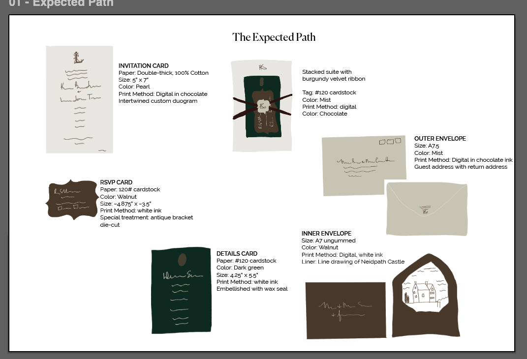
THE EXPECTED PATH
This route reflects exactly what we talked about in your discovery call. Letterpress and digital print methods, double-thick paper for the invitation, and some intentional, playful details throughout.