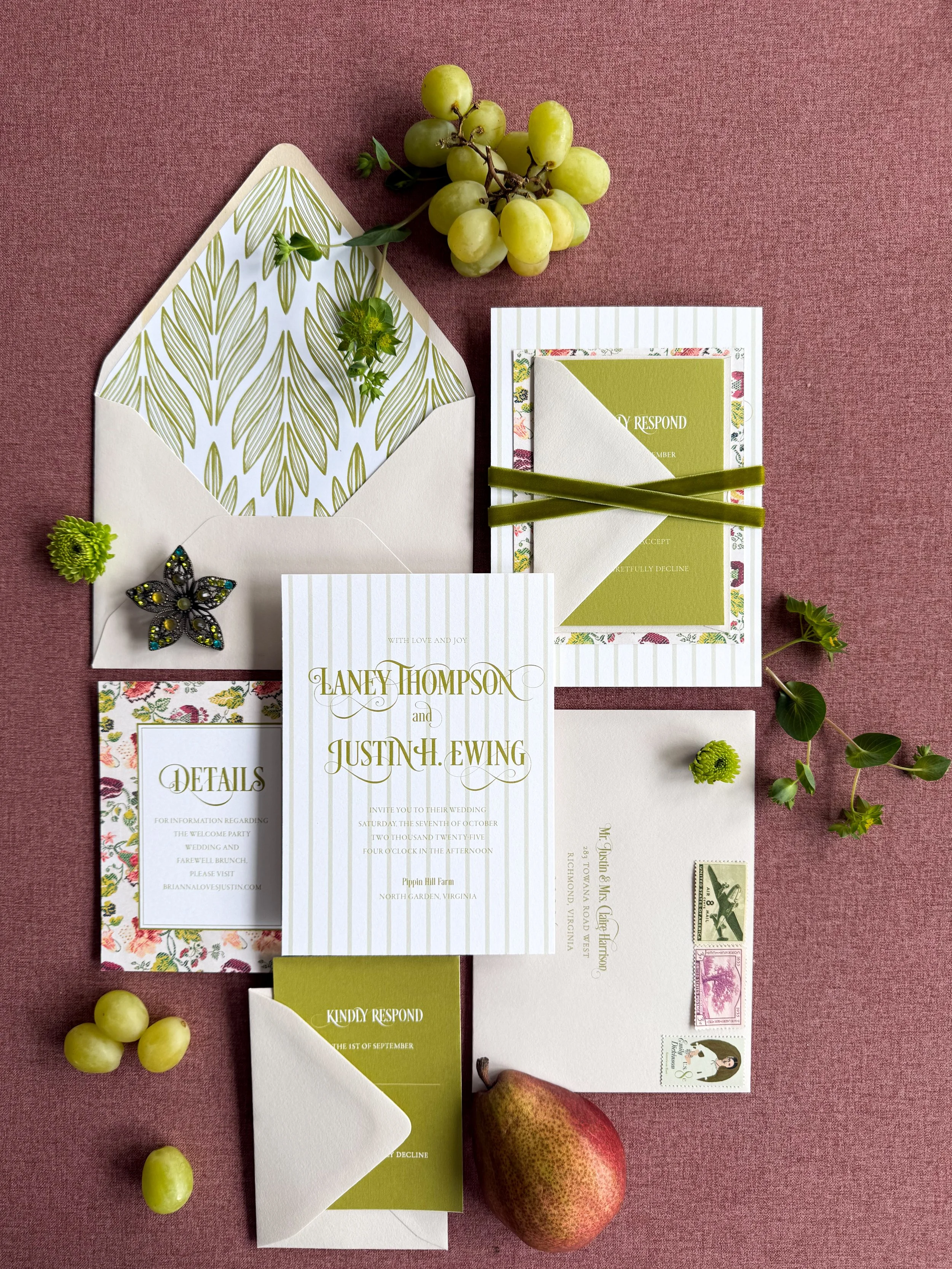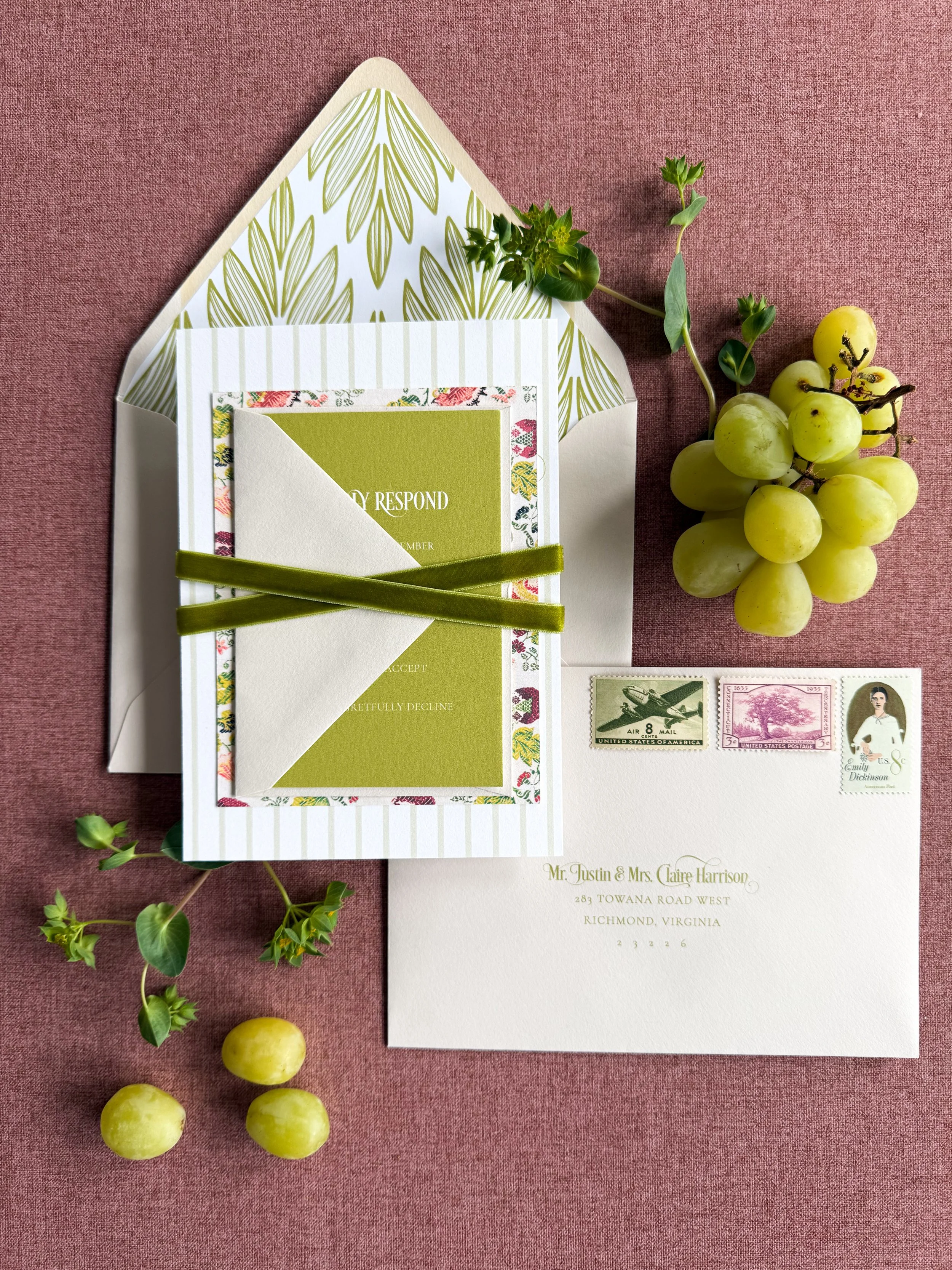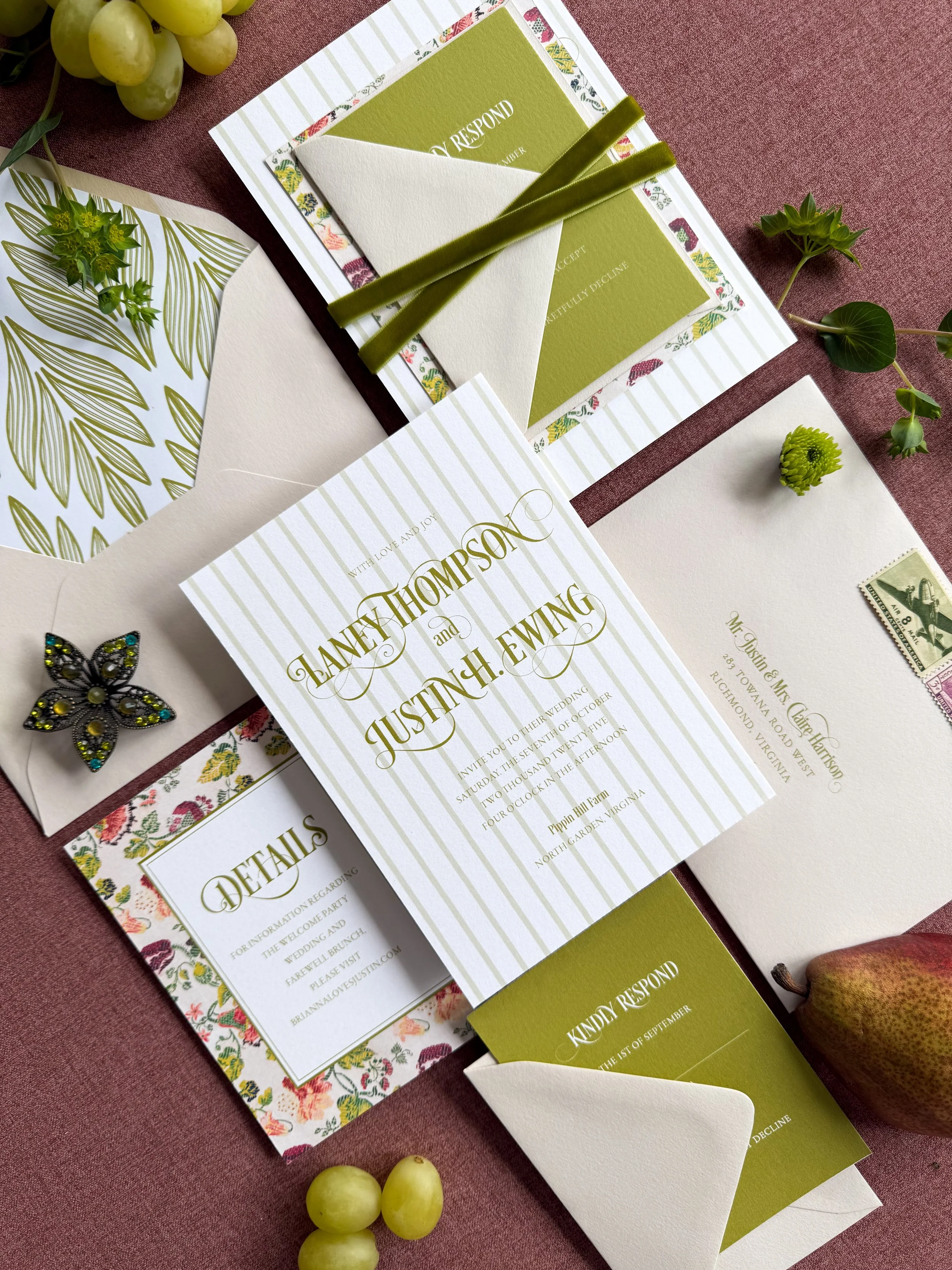
A fall wedding suite rooted in an 18th century Italian wallpaper.
Once I found it, every other decision fell into place around it.
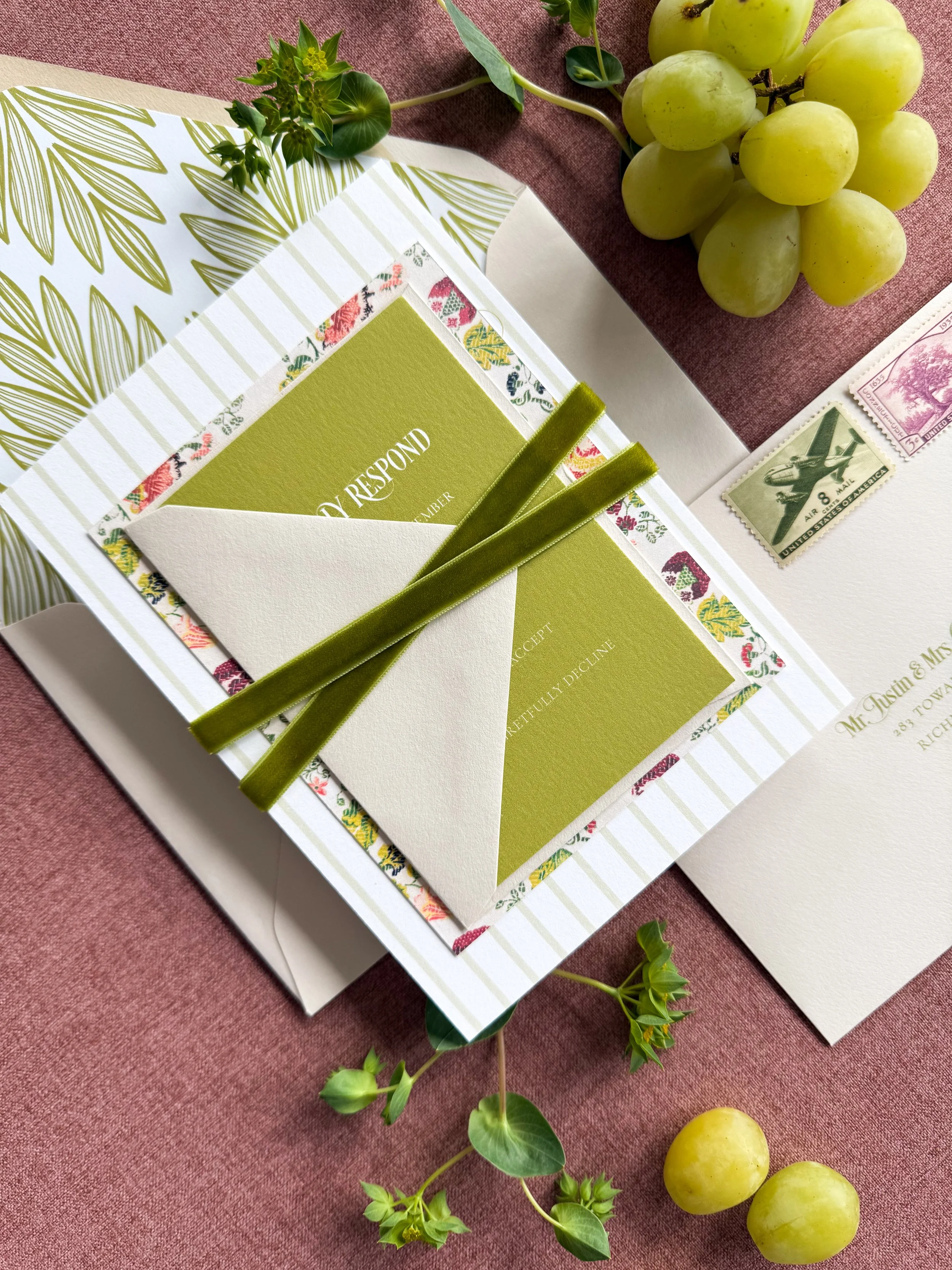
The pattern is rich and saturated, so digital printing was the only real option. No other method captures that kind of color depth and detail.
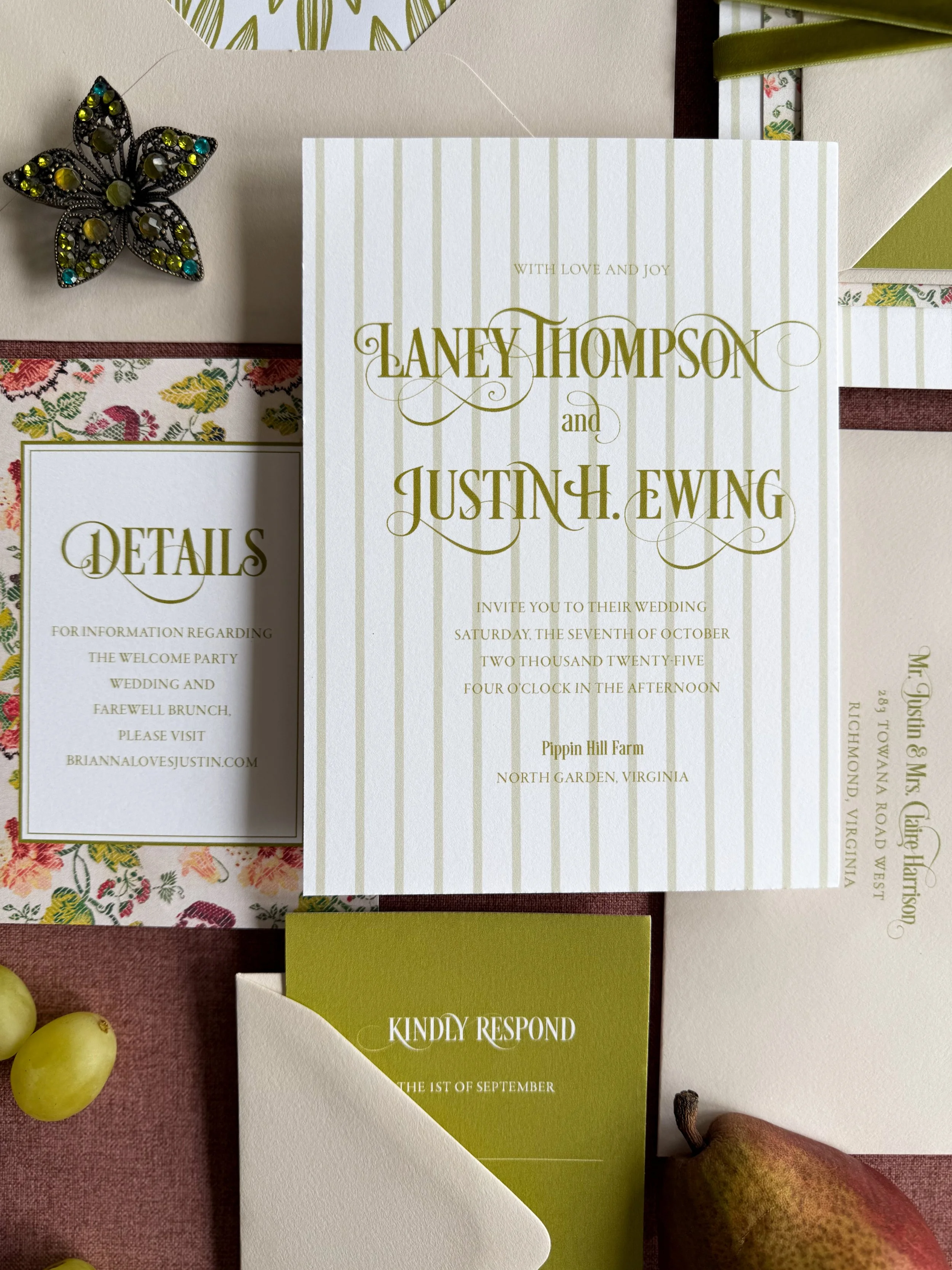
Because the floral is doing so much, the typography needed to hold its own. I landed on letterforms with bold strokes and delicate flourishes.
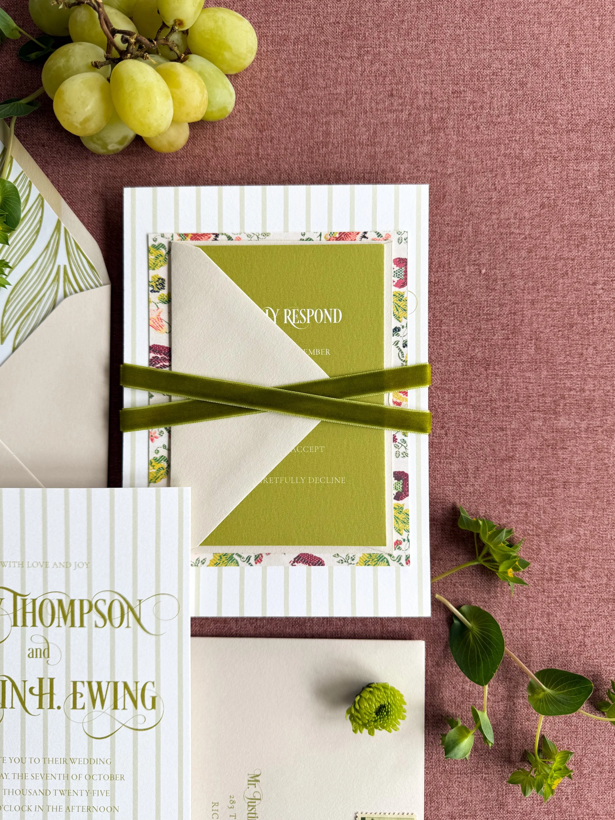
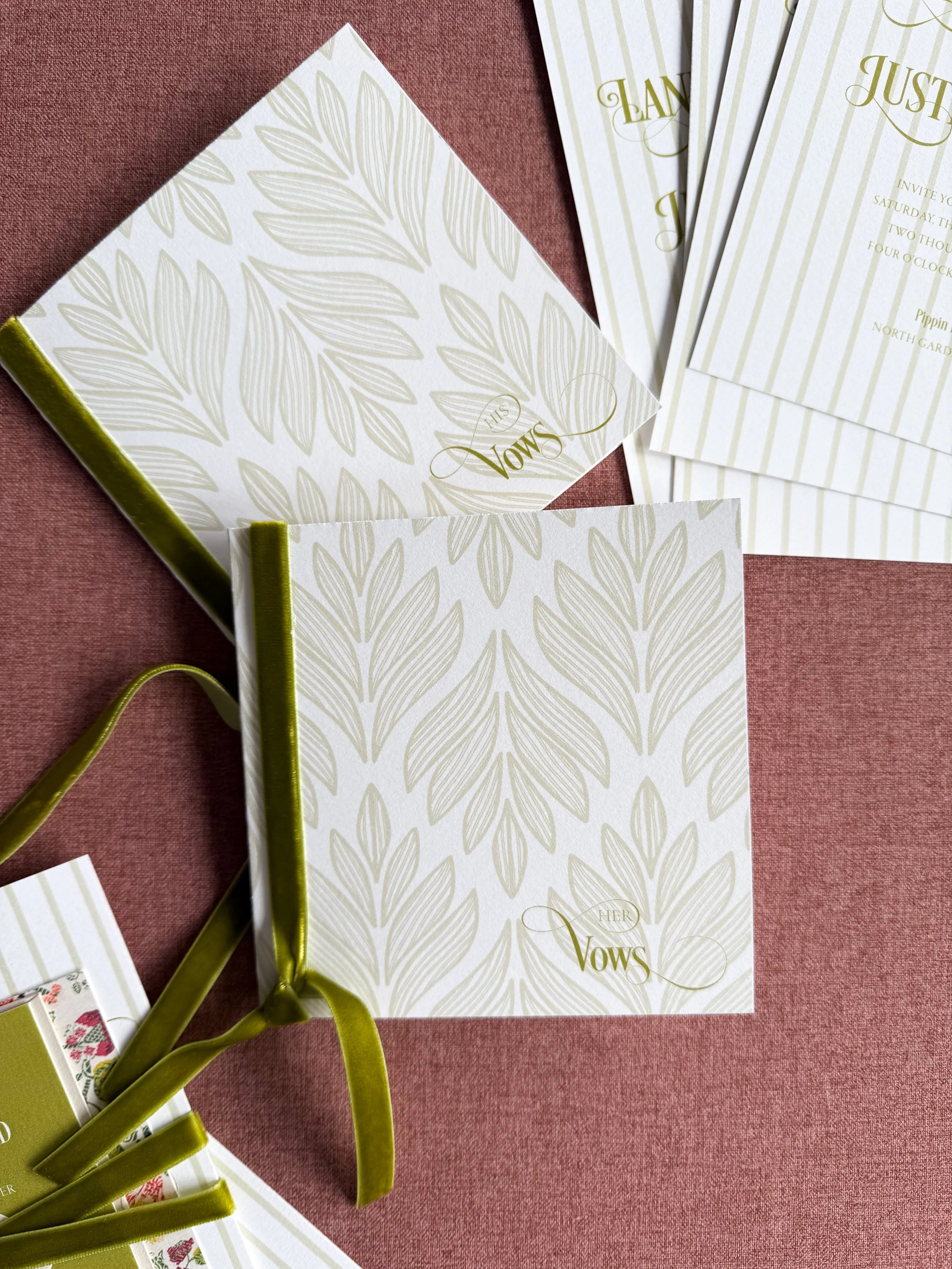
I love mixing stripes and florals. Then the envelope liner shifts things again with an art deco pattern, a little bolder, a little more structured.
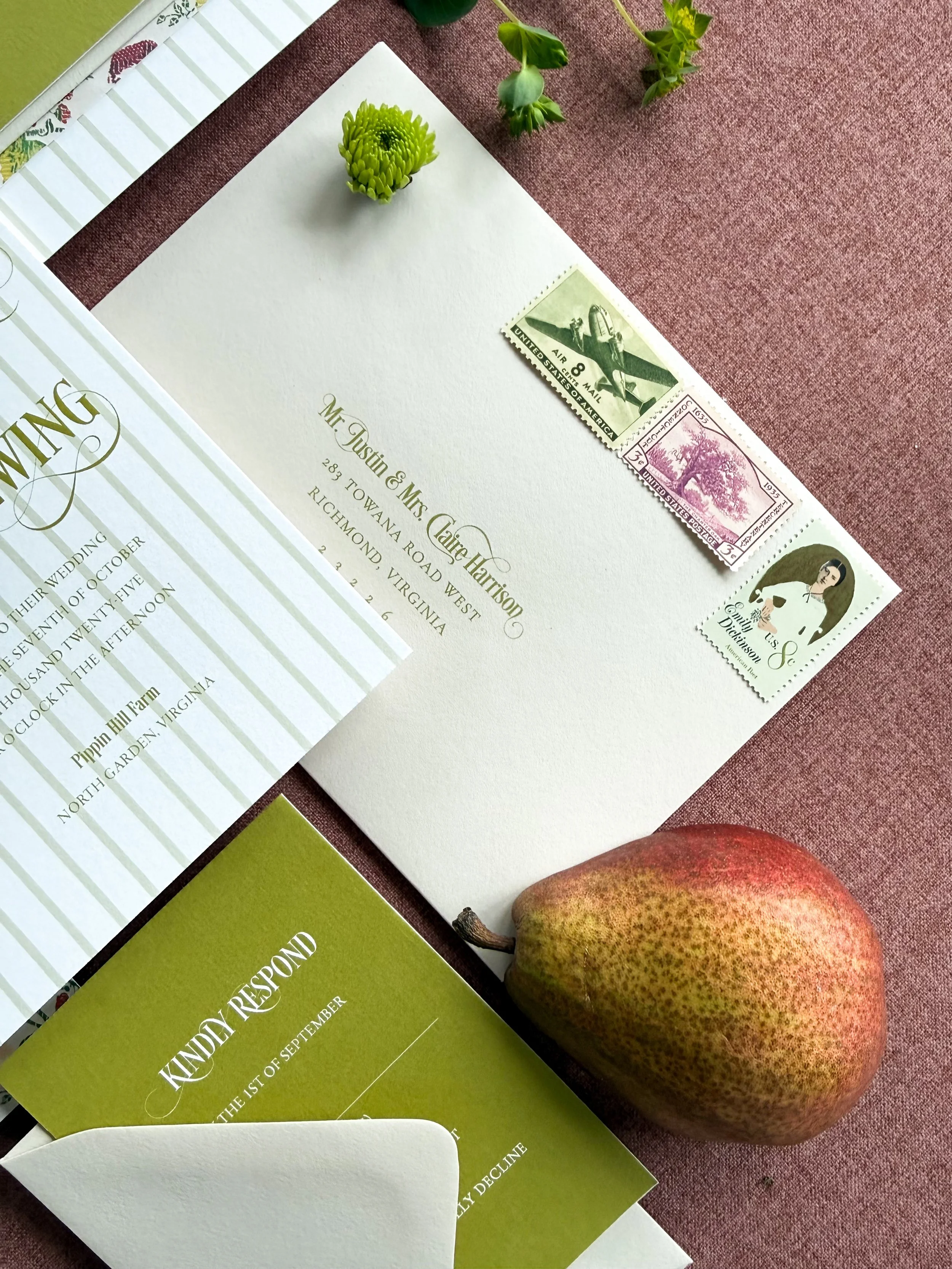
The outer envelopes stay completely neutral. When you have this much going on, you need somewhere for the eye to rest.
The velvet ribbon was an easy call for an October wedding. It ties the suite together literally and visually. The vow books use the same art deco liner pattern and the same ribbon so the whole collection feels like it belongs to itself.